Dave Cramer has been making ebooks for 15 years, and complaining about ebook standards for nearly as long. He was co-editor of the IDPF specification on fixed-layout ebooks, but in recent years has become heavily involved with the W3C and web standards, editing several specs for the CSS Working Group and writing “Requirements for Latin Text Layout and Pagination” for the Digital Publishing Interest Group. When not doing standards work, Dave writes XSL, works on typesetting with HTML+CSS, hunts for interesting information in mountains of XML files, and skis up and down literal mountains, preferably in Canada. He dreams of bringing the rich history of print design and typography to ebooks and the web.
Dave Cramer will be speaking at ebookcraft 2018 in a session called Jiminy and Dave's Excellent CSS Adventure.
I got rhythm, I got music, I got my man
Who could ask for anything more?
I’ve got daisies in green pastures
I’ve got my man
Who could ask for anything more?
from “I Got Rhythm” by George and Ira Gershwin
Those of us who do ebook production are both impossibly idealistic and gluttons for punishment. We’re always asking for more, and seldom getting it. But changes are afoot, which might someday give us more control over the vertical dimension of our ebooks.
Unsightly gaps
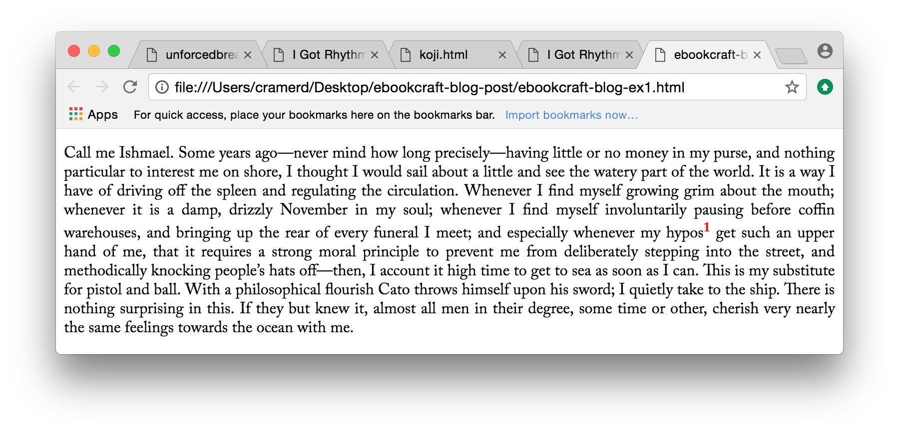
We’ve all seen a case like this, where an inline element (in this case a superscript) breaks the rhythm of a paragraph and leaves an unsightly gap:
Example 1: paragraph with superscript and inconsistent line height
Why does this happen? CSS was designed for an environment of constant change, where even the size of the text or the size of the screen can be altered. To bring a sort of order to this chaos, CSS has several fundamental principles:
Jesus said unto him, "A line box is always tall enough for all of the boxes it contains. This is the first and great commandment. And the second is like unto it: Thou shalt not permit content to overlap. On these two commandments hang all the law and the prophets."
So what’s happening in the above example is that the browser is making a box for every bit of text. It arranges all those little boxes in a line, matched up by their baselines, and if one of the boxes is a little taller, like for the superscript, it increases the height of the entire line.
This is easily fixed by telling the browser: “Don’t let the sup element contribute to the height of the line.”
Adding sup { line-height: 0; } to your CSS will give you the following outcome:
Example 2: paragraph with superscript but consistent line height
Much better.
It’s usually possible to fix these sorts of issues when they happen inside blocks. But it’s much harder when you have a block interrupting the text, like an image or an extract.
(A note about the word "grid": Recently, all major browsers shipped a feature called CSS Grid Layout. This allows really powerful and flexible layout in two dimensions, by placing content in grid cells. Below, I’m talking about a different kind of grid, often referred to as a baseline grid or just line grid. Think of the ruled paper you wrote on as a kid. Equally spaced horizontal lines are used as an aid to design, providing consistent spacing and a regular rhythm. Page layout programs such as InDesign often have “snap to grid” features, ensuring elements align.)
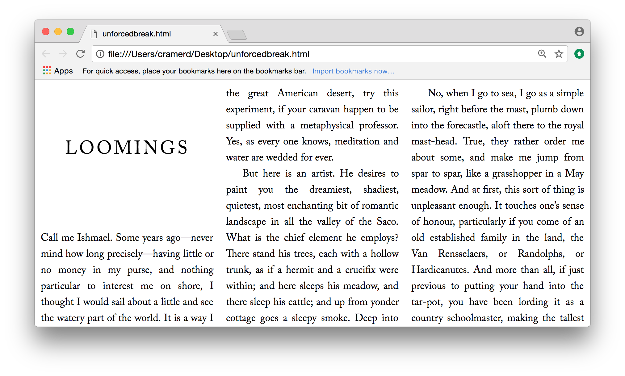
Let’s look at an example. I have a three-column layout:
Example 3: three-column text showing proper alignment
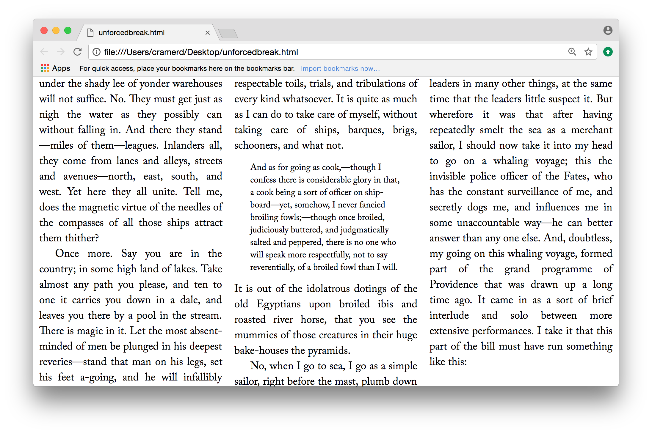
Looks great — all the text lines up along the same baseline. But what happens when something interrupts the text, like an image, a head, or a blockquote?
Example 4: three-column text with extract, still aligned
Above we use the same line height for the excerpt and the regular text, which looks ugly but it keeps us on our grid. But what if we want to use a different line height?
Example 5: three-column text with extract, misaligned due to changed line height
Now nothing lines up. In traditional typesetting, we’d fix this by adjusting the space above and below the blockquote so that we'd get back on the grid after the blockquote. But we can’t do this in CSS right now. People are, however, working on two different ways of fixing this: step sizing and line grids.
Step sizing
One way of expressing the problem above is that we want the excerpt to take up an integral number of lines. The main text has a line height of 16pt, so we would like the excerpt to take up some multiple of this. The idea of step sizing is to define a step size (in this case 16pt), and then have the browser automatically adjust lines or boxes to be a multiple of the step size.
This could work in both the inline context we started with (called inline step sizing) and the later block example (block step sizing). The former has been implemented by Google Chrome: inline-step-sizing adds space between every line, in order to make things align. But this is usually not a good thing for a design.
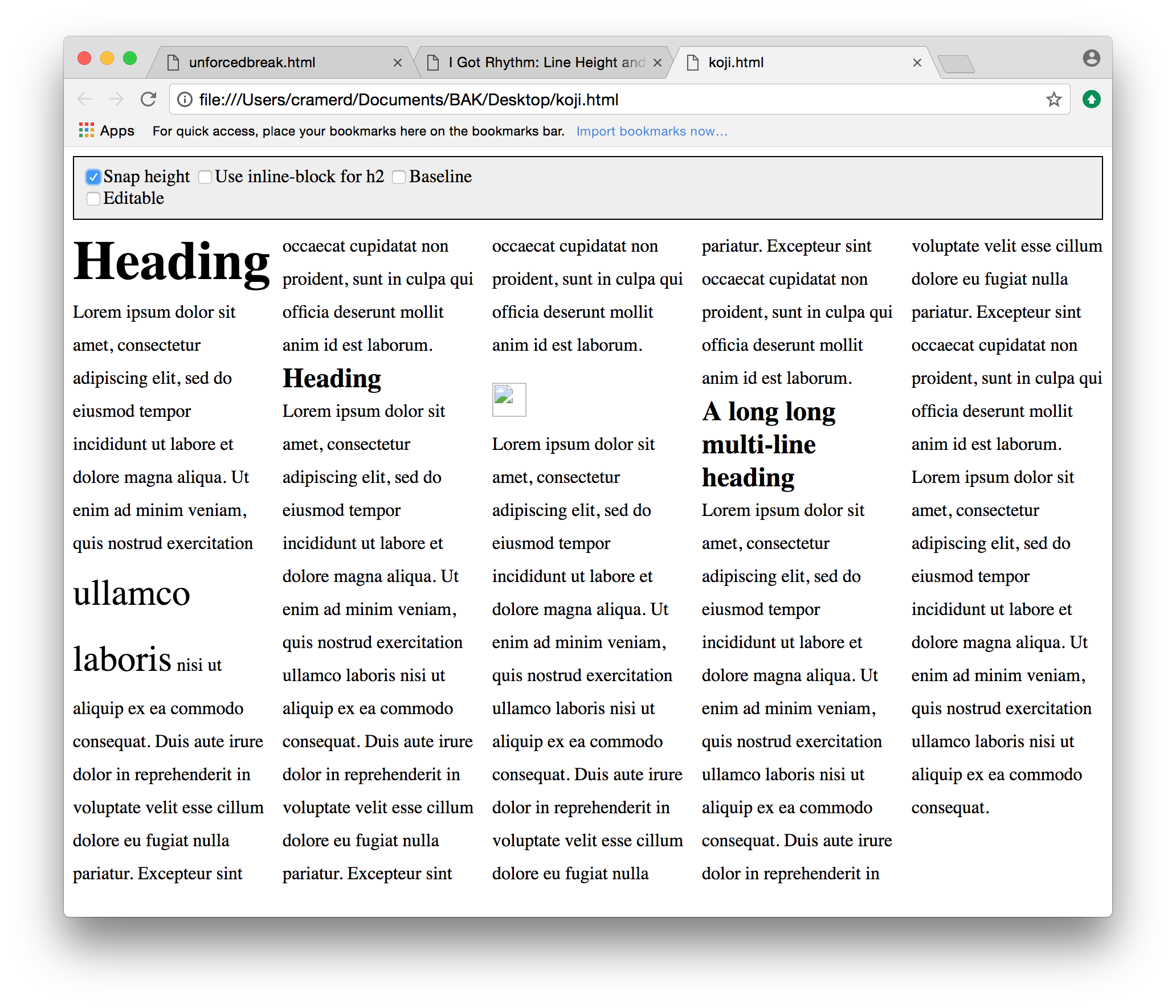
Here’s an example, showing a page before applying inline step sizing:
Example 6: multi-column text with heads and images, poorly aligned
And after inline step sizing:
Example 7: multi-column text with heads and images, aligned
But notice what it did: It changed the line height of everything, and also removed the spaces around the head. The design was destroyed to save the alignment. If there was block step sizing, things would be better, but there’s been no implementation of that feature yet.
Line grids
Another approach would be to set an explicit line grid on an element, and then allow other elements to position themselves relative to this grid. The CSS Line Grid spec does that but, again, it hasn’t yet been implemented.
A new synthesis?
The CSS Working Group is quite interested in solving these problems. Mozilla’s David Baron wrote up a proposal to take the best ideas from all these different places and see if we can find consensus. Stay tuned!
Further reading
If you'd like to hear more from Dave Cramer about all sorts of cool stuff coming soon to a browser near you, register for ebookcraft, March 21-22, 2018 in Toronto. You can find more details about the conference here, or sign up for our mailing list to get all of the conference updates.


