They came, they coded, they proved how well-designed an ebook can be.
ebookcraft's first-ever ebook design competition, So You Think You Can Code, came to a close on March 31 when we announced the 2016 grand prize winner live to an excited crowd of conference-goers. Congratulations to Rebecca Springer, who took home the $2,500 cash prize courtesy of Rakuten Kobo, subscriptions to Adobe Creative Cloud and FlightDeck, and eternal nerd glory.
Kobo's Ben Dugas (far left) with winner Rebecca Springer (second from the right) with judges (left to right) Joshua Tallent, India Amos, and Monique Mongeon.
For the competition, we invited ebook designers near and far to tackle a messy EPUB and turn it into a glorious, beautifully designed, platform-agnostic, fully accessible ebook. Our panel of expert judges–Joshua Tallent (Firebrand Technologies), India Amos (Amplify), and Monique Mongeon (Penguin Random House Canada)–reviewed all the submissions across multiple devices and declared Rebecca's submission the most deserving of the grand prize.
So what exactly did Rebecca and the other competitors have to work with? To give you an idea, here's a snippet of the over-burdened HTML provided in the original, messy EPUB. Note the character/paragraph overrides, complete lack of semantic structure, and excessive use of <span>:
Scary right?
Here is a transcript of the overview Joshua gave at ebookcraft, explaining why Rebecca's submission rose to the top, plus a few examples of the submission:
Of all the submissions we received, Rebecca’s offered the best reader experience across different modes, systems, and devices. The clean and easy design did a successful job of fitting the content into a digital reading environment. In particular, her font selections were well thought-out and clean and her submission degraded gracefully across the device spectrum, including some very old devices.
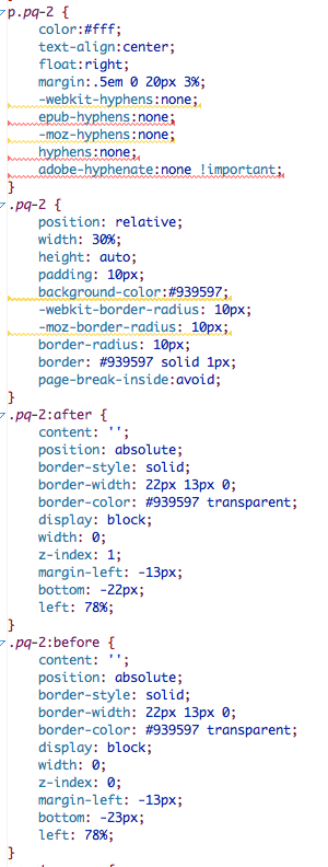
Rebecca's pull quotes were particularly smart:
It’s of course important to respond to the user’s needs, and her thoughtful visual design accomplished this. Notably, she reworked the images provided in the sample file to respond to the specific needs of a digital reading experience.
She also responded to the accessibility needs of print-disabled readers through thoughtful use of alt-text with those same images.
The sample file we provided was a disaster in regards to the embedded HTML code. In her submission, Rebecca cleaned this up significantly and simplified both the HTML and the CSS. The image compression was also successful.
You can find samples of Rebecca's CSS here, here, and here , which is nicely written and commented. And below is a sampling of her sidebars for the cookbook, with an image on top and live text that's hidden:
Finally, the QA nerds on the judging panel noted that it was a well-formed file. If you had never touched this project before and you were assigned to develop it further, it felt like you could go in and continue working without doing serious archaeology.
A bit of Rebecca's added semantics:
Congratulations again to Rebecca, and thanks to all those who competed this year, our prize sponsors Rakuten Kobo, Adobe, and Firebrand Technologies, and House of Anansi and Figure 1 Publishing for contributing the ebook content.
If you think you can code and want a chance to compete for glory next year, sign up for updates or keep an eye on Twitter (#ebookcraft).


